Detailed Explanation of New Features of Strategy Interface Parameters and Interactive Controls
When developing strategies on the FMZ Quant Trading Platform, it is necessary to design strategy parameters and strategy interactions. The FMZ Quant Trading Platform is committed to providing easy-to-use and powerful quantitative trading tools, and continuously iterating product design and functions. By upgrading "strategy parameters" and "interactive controls", the design flexibility of parameters and interactions in strategy design has been further increased. The functions of strategy parameters and interactive controls have been enhanced, making some design requirements easier to achieve. In this article, let's re-understand two essential contents in strategy design: "strategy parameter design" and "strategy interaction design".
Strategy Interface Parameters
The types of strategy parameters in FMZ Quant have not increased, and they are still the five types of parameters we are familiar with:
Numeric parameters
String parameters
Boolean parameters
Drop-down box parameters
Encrypted string parameters
Then you will definitely ask me, what content has been added and optimized in this platform update?
This upgradation adds "component configuration" for parameter binding controls, simplifies the "grouping" and "parameter dependency" functions, and integrates these two functions into "component configuration". For the default value of the parameter, an "optional"/"required" option is added to determine whether the strategy has the conditions to run. If the parameter is set to "required" but no specific parameters are written in the parameter control when the strategy is executed, the strategy cannot run at this time.
Now that we have a general understanding of the upgrade changes, let's test it in detail.
1. Number Parameters
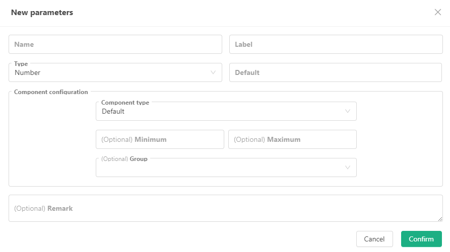
We briefly talked about the "optional"/"required" functions before, so I won't go into details here. The following mainly explains "component configuration", which can be simply understood as:
Set various properties, types, and rules of the control that the parameter corresponds to (is bound to). The default control bound to the numeric parameter (number type) is the input box. You can set the rules for the data received by the input box, that is, use the "minimum value" and "maximum value" controls in the figure to set.
In addition to the default input box control, the platform has added:
Time Selector
In "Component Type", select "Time Selector", and the input box control on the strategy interface corresponding to the current parameter will become a time selection control. When setting this parameter, select a specific time, and the variable value of this parameter is the timestamp corresponding to the set time.
Such controls are usually used for time range settings, start and end date settings. This is very convenient and intuitive. Using the date control can let the strategy know the corresponding timestamp, and there is no need to write complex time conversion code.
The variable value of the interface parameter is: value (representing the timestamp)Sliding Input Bar
If set as a sliding input bar control, you must specify the "Minimum Value" and "Maximum Value" to determine the range of the slider. The step size refers to the value of the interval on the slider.
The sliding input bar can implement a parameter for controlling the stop loss and take profit levels conveniently. Of course, there may be more other designs, which will not be repeated here.
The variable value of the interface parameter is: value (representing the position information of the slider on the slider)
2. Boolean Parameters
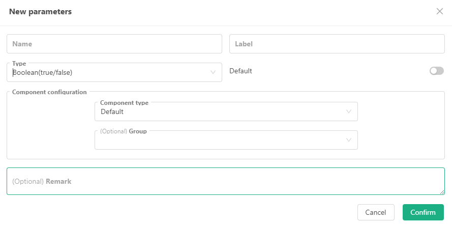
Boolean parameters are special in that they only have one corresponding control, which is the default switch control. And the parameter default value is also required.
Because Boolean values are either true or false, they are binary options. Therefore, it is very appropriate to use a switch control to correspond to this parameter type.
Generally, Boolean type parameters are used to control whether certain strategy functions are enabled on the platform.
3. String Parameters
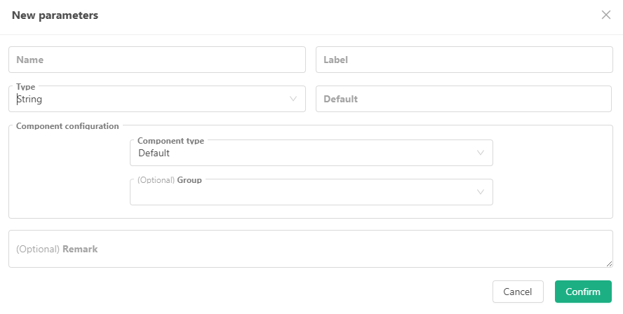
In addition to the default input box control, the platform has added:
Text
In "Component Type", set to: Text. The input box control on the strategy interface corresponding to the current parameter will be changed to a larger text box.
The difference between the text control and the ordinary input box control is that the text entered in the text box can wrap, and the text box can adjust the control size.
The variable value of the interface parameter is: string.Time Selector
In "Component Type", select "Time Selector". The input box control on the strategy interface corresponding to the current parameter will become a control for setting time and date.
"Time Selector for Component Type of String Parameter" is different from "Time Selector for Component Type of Numeric Parameter". The time selection of string type parameter has an additional "Time Format" option, which can set the selection format of the control:
Date: When "Time Format" is set to "Date", the control is a complete time selection control for selecting year, month, day, hour, minute, and second, and supports one-click selection of the current time.
Time: When "Time Format" is set to "Time", the control is a time selection control for selecting minute, hour, and second.
Year and Month: When "Time Format" is set to "Year and Month", the control is a time selection control for selecting year and month.
Year: When "Time Format" is set to "Year", the control is a time selection control for selecting year.
The variable value of the interface parameter is: string (formatted as the corresponding time).
- Color Selector
In "Component Type", select "Color Selector". The input box control on the strategy interface corresponding to the current parameter will become a color selection control. It
is generally used to design parameters for setting colors.
The variable value of the interface parameter is: string (the color value corresponding to the selected color, for example: #7e1717).
4. Drop-Down Box Parameters
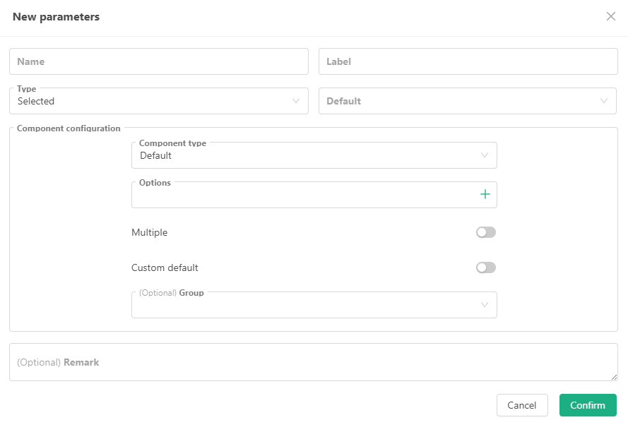
The default corresponding control of the drop-down box parameter is a drop-down box, but this time a lot of upgrades have been made to the previous simple single-select drop-down box:
Support Multiple Selections
You can select multiple options at the same time in the drop-down box control corresponding to the drop-down box parameter. At this time, the variable value of the drop-down box parameter is no longer the selected option index, but an array. The array contains the indexes or bound data of all selected options.Support Custom Default Values
When this option is turned on, you can customize the default values instead of having to select an option from the drop-down box as the default value.Added the function of binding numeric values and strings to drop-down box options.
Bind a string or a numeric value to an option. When setting this parameter, the value of the drop-down box variable is no longer the index of the selected option, but the string or numeric value bound to the selected option.
In addition to the default drop-down box control, this time the platform adds:
- Segment Controller
In "Component type", select "Segment controller". The control bound to the current parameter becomes a selectable segment slider, and you can select a specific segment block.
Generally, it can be designed as follows: Usually used to switch between several mutually exclusive options, often used to filter content by category or tag, and choose between different operation modes.
The variable value of the interface parameter is: the index of the selected part of the segment controller or the data bound to the selected part (the bound data supports numeric values and strings).
5. Encrypted String Parameters

The encrypted string parameter is also quite special, and it has only one corresponding control, which is the default encrypted input box control.
On the platform, encrypted string type controls are generally used to set sensitive information, such as secret keys, passwords, etc. These input parameter values will be encrypted locally before transmission.
The variable value of the interface parameter is: string.
For all the above types of strategy interface parameters, this upgrade integrates the previous "parameter grouping" and "parameter dependency" functions into "component configuration". There are "grouping" and "filter" settings in the component configuration of all interface parameters.
Grouping
You can enter the label you want directly to group in the group drop-down box control, and use the Enter key to confirm the group input. The system will record the currently entered label in the grouping option. Then you can specify a group for the current interface parameters.
After grouping, on the strategy backtesting/live trading interface, the parameters marked as a group will be displayed in a grouping area.Filter
Enter some expressions in the filter control to determine whether the current parameter needs to be activated and displayed. This function can realize that the current parameter depends on a certain parameter setting to choose to display or hide.
Filter expression example:
Filter format: a>b , a==1 , a , !a , a>=1&&a<=10 , a>b
Here, both a and b represent variables of strategy interface parameters.
Interface Parameter Testing Strategy
If the above explanations are a bit unintuitive, the best way to understand them is to actually use and test these parameter functions:
Take JavaScript language strategy as an example:
function main() {
    Log("---------------------------Start testing numeric type parameters---------------------------")
    Log("Variable pNum1:", pNum1, ", Variable value type:", typeof(pNum1))
    Log("Variable pNum2:", pNum2, ", Variable value type:", typeof(pNum2))
    Log("Variable pNum3:", pNum3, ", Variable value type:", typeof(pNum3))
    Log("Variable pNum4:", pNum4, ", Variable value type:", typeof(pNum4))

    Log("---------------------------Start testing Boolean type parameters---------------------------")
    Log("Variable pBool1:", pBool1, ", Variable value type:", typeof(pBool1))
    Log("Variable pBool2:", pBool2, ", Variable value type:", typeof(pBool2))

    Log("---------------------------Start testing string type parameters---------------------------")
    Log("Variable pStr1:", pStr1, ", Variable value type:", typeof(pStr1))
    Log("Variable pStr2:", pStr2, ", Variable value type:", typeof(pStr2))
    Log("Variable pStr3:", pStr3, ", Variable value type:", typeof(pStr3))
    Log("Variable pStr4:", pStr4, ", Variable value type:", typeof(pStr4))

    Log("---------------------------Start testing the drop-down box type parameters---------------------------")
    Log("Variable pCombox1:", pCombox1, ", Variable value type:", typeof(pCombox1))
    Log("Variable pCombox2:", pCombox2, ", Variable value type:", typeof(pCombox2))
    Log("Variable pCombox3:", pCombox3, ", Variable value type:", typeof(pCombox3))

    Log("---------------------------Start testing encryption string type parameters---------------------------")
    Log("Variable pSecretStr1:", pSecretStr1, ", Variable value type:", typeof(pSecretStr1))
}

Complete parameter testing strategy: https://www.fmz.com/strategy/455212
There is a parameter dependency design hidden in the above parameters. Many strategies have the requirement to enable a series of settings based on a certain parameter, which can be achieved with parameter dependencies like this.
Interactive Controls
The FMZ Quant Trading Platform also has five types of strategy interactive controls, which have been optimized and upgraded this time. "Component Configuration" has been added to simplify the grouping function.
1. Number Interactive Controls
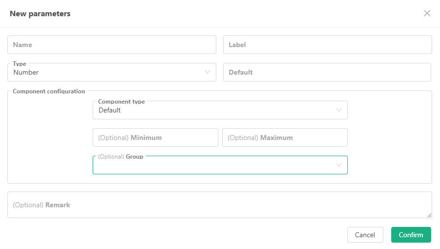
The interactive controls are basically the same as the "component configuration" of the strategy interface parameters. In addition to the default input box controls, the component types also support:
Time Selector
The interactive command sent contains the timestamp of the selected time.Slider Input Bar
The interactive command sent contains the value represented by the selected slider position.
The usage is the same as that of various component types of strategy interface parameters, so it will not be repeated here.
2. Boolean (true/false) Interactive Controls
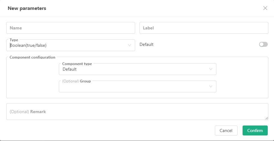
The interactive controls are basically the same as the "component configuration" of the strategy interface parameters.
3. String Interactive Controls
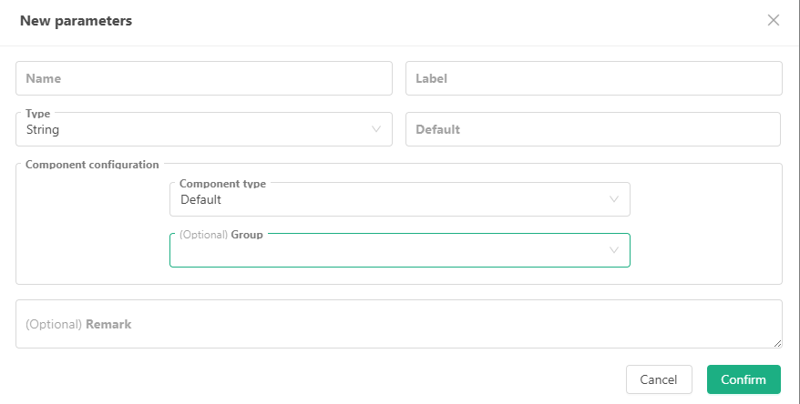
In addition to the default input box control, the component type also supports:
Text
The interactive command sent contains the content entered in the text box.Time selector
The interactive command sent contains a time string of the selected time, with multiple formats to choose from.Color Picker
The interactive command sent contains a color value string for the selected color.
4. Drop-Down Box (selected) Interactive Control
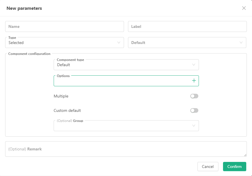
The drop-down box of the interactive control has also been upgraded: "support multiple selections", "custom default values", option binding to specific data, etc.
In addition to the default drop-down box component, the following are added:
- Segment Controller
The interactive command sent contains the index or bound data of the selected slider.
5. Button Interactive Control
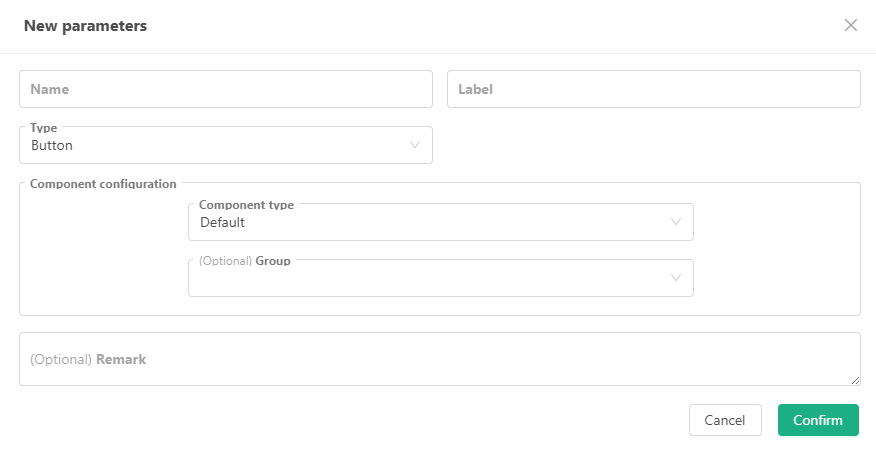
The button type interactive control does not have any input items. When triggered, the interactive command sent contains only the button control name.
Interactive Control Testing Strategy
The best way to understand it is to test it manually. A testing strategy is also prepared here.
It should be noted that interactive controls cannot be tested in the backtesting system, and only live testing can be created.
function main() {
    var lastCmd = ""
    while (true) {
        var cmd = GetCommand()  // Receive messages generated by interactive controls
        if (cmd) {
            Log(cmd)
            lastCmd = cmd
        }
        LogStatus(_D(), lastCmd)
        Sleep(500)
    }
}
Enter some random information, set some options, and then click the interactive control button to generate interactive messages. The strategy captures the messages and prints them out.

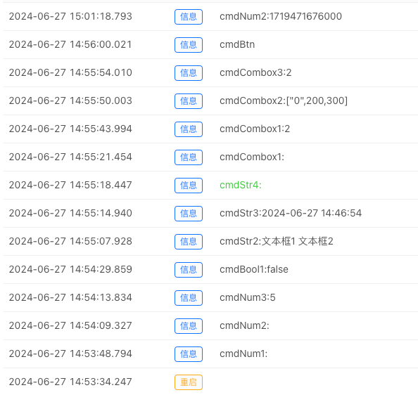
Completed interactive control testing strategy: https://www.fmz.com/strategy/455231